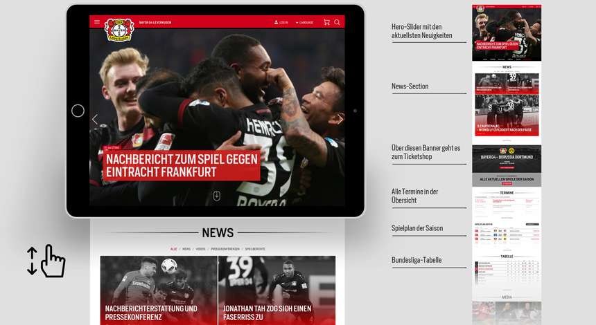
Two issues were particularly important to us in designing the new website: We wanted it be more manageable and easier to navigate. Nothing is more annoying than having to repeatedly click to get through to the desired content. The design of our website is therefore based on a derivation of the so-called Atomic Design.
It structures the individual sites (hubs) in vertically organised sections and elements. In turn, that enables flexible handling of functional areas in the background. That means additional pages can be created quicker and easier.
That has enabled us to significantly reduce the click depth. That means you get to where you want to go to much quicker – without diversions and hurdles.
The hamburger menu ensures greater clarity in the header section that contains all the relevant pages. That makes our website look tidier and provides plenty of space for what’s really important to us: large photos, full-screen image slider and Lightbox galleries. Attractively designed statistics and tables. Animated news elements. And, as football is full of emotion, we want to appeal to you in that way.
In contrast to current design trends with many websites, which are more neutral and with a scarcely differentiated look, we consciously used existing graphical elements like bars, lines, fonts and colours contained in our corporate design. We place great value on a consistent, clearly identifiable, visual appearance in Black and Red. That can be on our website, on our App, in the Shop or in the Werks11 magazine, either in terms of content or visually: We want Bayer 04 to be palpable and to come alive – with our unique, personal tone.